分析过程
这个图片最大的特点就是信息错综复杂。那么我们在25秒以内要套用文波教育独家的
五段式高分结构去把握信息点。
首句开头
首先第一句可以这样开头:
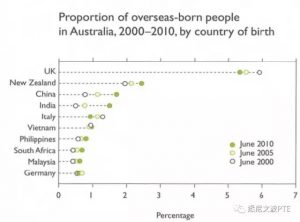
The graph shows the proportions of overseas-born people in Australia.
极值描述
然后在接下来的信息点我们选取相对直观的最大值UK进行描述。
UK accounted for largest proportion of overseas born people, and this figure declined a little bit to around 5 percent during this period, followed by New Zealand.
在这里我们对于New Zealand的具体数值进行了适当忽略。同时选取简单句式followed by进行点到为止的描述。
趋势描述
然后图片从上往下看是China和India。通过25秒准备时间的稍加分析,我们可以看到这两个国家的数据是随时间持续上升的。所以这里用一句话既可以描述信息点又可以把一个关键的趋势元素覆盖到,做到一举两得的目的。那么这个句子可以这么说
Overseas-born people from China and India both increased to around 2 percent.
剩余数据处理
而剩余的其他数据点由于过多过杂,我们可以简单的进行数据处理。答案如下
Other counties such as Italy, Vietnam, Philippines, South Africa, Malaysia and Germany only represented a very small share of this figure and remained quite stable from 2000 to 2010.
答案整理
所以最后我们通过25秒的充分准备和适当的数据分析处理,得出了一个具有可复制性和推导步骤清晰明了的答案。
具体整理如下:
The graph shows the proportions of overseas-born people in Australia.
UK accounted for largest proportion of overseas born people, and this figure declined a little bit to around 5 percent during this period, followed by New Zealand.
Overseas-born people from China and India both increased to around 2 percent.
Other counties such as Italy, Vietnam, Philippines, South Africa, Malaysia and Germany only represented a very small share of this figure and remained quite stable from 2000 to 2010.
Michael老师结语
在PTE考试中,DI还是有一定概率遇到复杂图片的。在遇到复杂图片的时候,我们考生不要慌。而是应该充分利用25秒准备时间,清晰明了的遵循答题步骤,推导出合理而且可以流利说出的答案。今天的内容你学会了么?


