
这里不仅集合了A类小作文全部题型的技巧和范文,还有墨尔本文波雅思最系统的失分点讲解,所有问题一网打尽!用最短的时间写出最高分的小作文!
失分点解析:
雅思A类小作文(这里具体指除流程图与地图以外的图表题)的题目要求:Summarize the information by selecting and reporting the main features, and make comparisons where relevant中要求考生在写作中体现出总结、选择并描述数据以及比较信息的能力。
通常,图表中关键的数据可以根据图表类型被快速找出,如:
点:起点、终点、交汇点、最高点、最低点
线:上升、下降、波动、保持不变
面:最大值、最小值。
但是,在具体描述图表时,考生往往会出现只是单纯将关键数据一一罗列在文章中,而忽略了整合数据之后,在表述中体现出对数据的比较,也就是题目中要求的“make comparisons”。
下面根据不同图表的类型,分析如何确保文章能完成题目中要求的make comparisons.
Line Graph (单线)
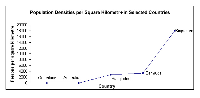
这道单线题中出现了5个国家,显然需要在他们之间作出比较。我们可以将持平的Greenland和Australia归类,相似的Bangladesh以及Bermuda归类,把五个数据分为三个group进行比较。
例:The most densely populated country reported was Singapore. Bermuda and Bangladesh had moderate population densities, while the densities of Australia and Greenland were very low.
Line Graph (多线)
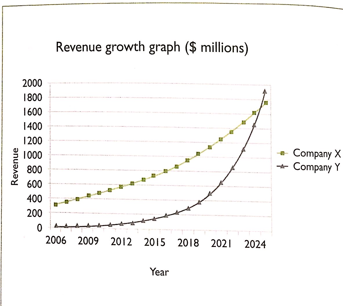
多线图既要做到单线中关键数据的描述,也要包括线与线之间关系的描述。
例句:Predictions are that the company Y’s growth will surge between 2019 and 2024 to just overtake Company X at $1900m.
例句中company Y’s growth will surge between 2019 and 2024描述了Company Y的revenue变化,同时通过运用动词’overtake’点出了Company X和Y在2024年前后revenue的比较关系。
Bar Chart
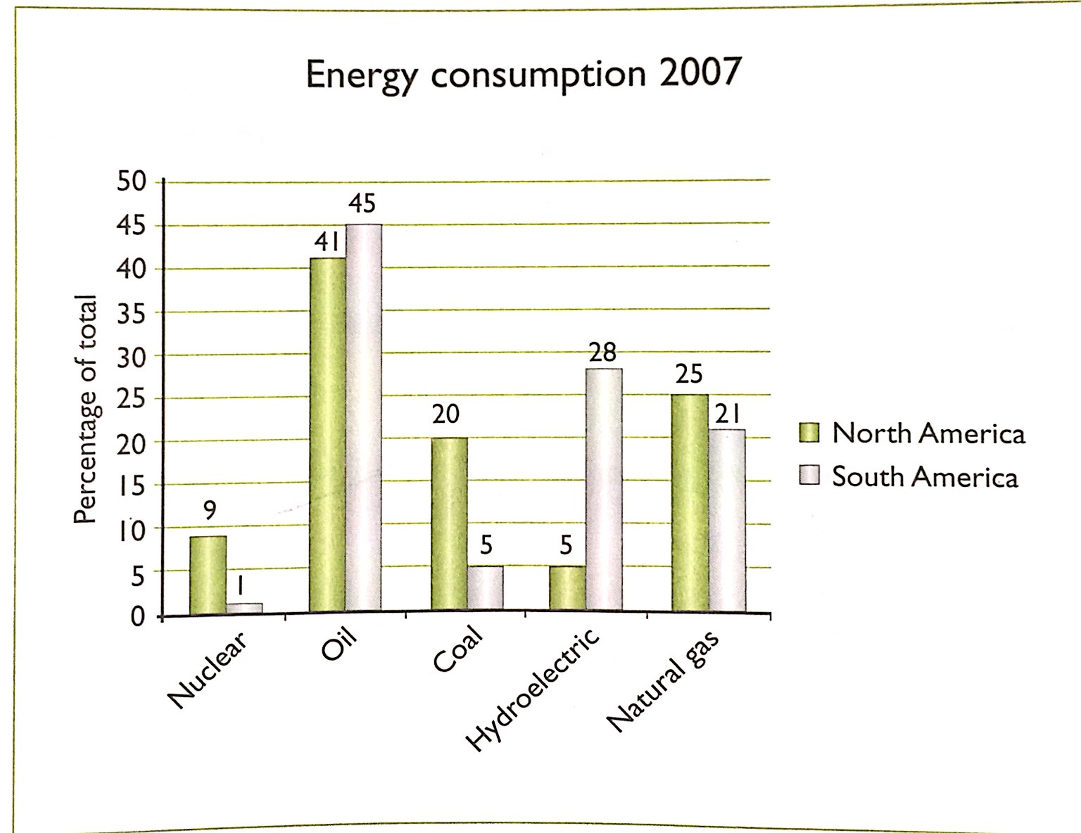
Bar chart中一般可以进行比较的数据比较多,考生一定要注意在整理数据的过程中按照一定的顺序,以免造成自己的逻辑混乱,影响到文章的连贯以及逻辑性。
以此图为例,可选的比较包括:
1. North America和South America对同一种能源的使用比较
2.North America对于5种能源的使用比较
3.South America对于5种能源的使用比较
考生首先可以按以上进行一个可选的对比关系整理,接下来按照这个顺序进行比较。这样既可以保证不遗漏可以比较的对象,也可以让自己的思路更顺畅。
例句:The main differences were that South America used a lot more hydroelectric energy than North America, 28 per cent compared to 5 per cent, but in North America 20 per cent of its energy came from coal compared to only 5 per cent in South America.
例句比较了两个国家对能源的使用情况,以‘main differences’做主语,以对比的方式引出了两个国家对两种能源的使用数据。
Pie Chart
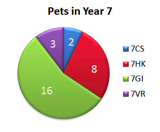
由于Pie chart包含的数据往往比较简单明了,因此考生最容易在此种图标的描述中发生单纯列数据的情况。其实,Pie chart的数据比较很直观,考生可以通过最值(如maximum,minimum),也就是运用形容词的最高级形式(如largest, most)表现出数据的比较。
例句:The largest number of pets is in form 7GI.
The most pets of year 7 are in form 7 GI and the least in form 7CS.
Table
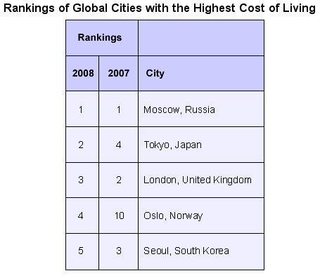
Table的比较方法与Pie Chart相似,都是通过特殊数据,也就是最值来表示每个group之间数据的比较。需要注意的与bar chart一样,在比较式要按照一定的逻辑顺序,如,先比同列再比同行。
例句:In both 2007 and 2008, Moscow was rated as the city with the highest cost of living. Moscow, Tokyo, London, Oslo and Seoul were rated as the world’s five most expensive cities to live in.
Between 2007 and 2008, Moscow remained the world’s most expensive city.
A类小作文满分范文&技巧全链接整理:
整体流程&提分技巧
http://wenbo.tv/ielts_writing_task_1/
线图
http://wenbo.tv/ielts_writing_academic_task_1_line_gragh/
柱状图
饼图
http://wenbo.tv/ielts_writing_academic_task_1_model_answer_pie_chart/
表格
http://wenbo.tv/ielts-writing-table-cambridge/
组合图
http://wenbo.tv/ielts_writing_combination_gragh/
http://wenbo.tv/ielts_writing_academic_task_1_model_answer_combination_gragh/
流程图
http://wenbo.tv/ielts-cambridge10-diagram/
地图